So, because of my portfolio, I spent the last few weeks working in animation gremlin hell. Observe my creations…
Animatics
Animatics are storyboards used to time action out by being put to the music or dialogue. They give a sense of when certain things happen, and can be used to see how the direction works with the music in real time.The advantage of an animatic is they’re quick to make and revise, and can be sketchy and expressive. They’re also good for sharing with a team of animators so that everyone can see the basic timing of the animation and give their imput.
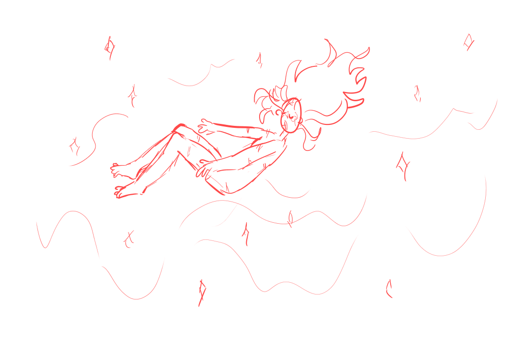
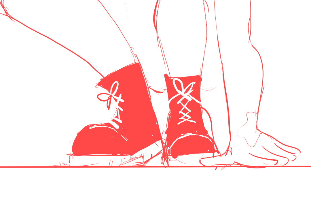
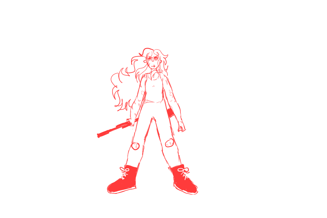
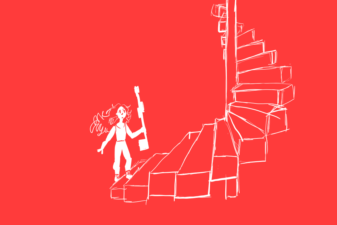
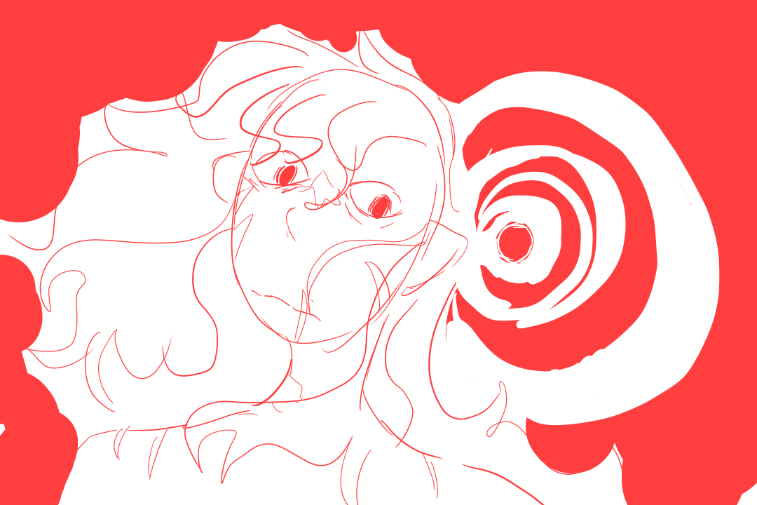
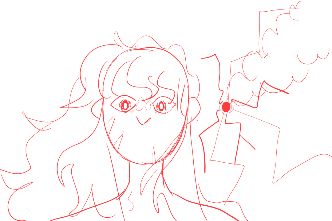
The Nightmare Animatic
This animatic was initially a project I started for a 14 day drawing challenge, and then I enjoyed it so much I continued. I think being forced to draw characters from different angles was really good, and the fact that the drawings where rough sketches allowed for me to move with the flow without getting to caught up in perfecting individual drawings.
The music is 'nightmovin' by Neil Cicerega, a mashup from ‘mouth dreams’, that was perfect for an animatic about a character on a journey of revenge. The character in question, Red, has been around in my head in various incarnations for years, and the other character, Orange has been too (hence why they have such weird names).
The story that Orange and Red have is a strange one. The premise is that Red is chasing Orange through different versions of Orange’s life, trying to live a happy life with them. The trouble is that Orange is very prone to dying. The good thing is that everytime Red is killed trying to save Orange, Red wakes up and has another chance, with a new scar to denote how they where killed. This way, the characters are reborn in different worlds, change genders (hence the they/them pronouns for the both of them) and have new lives. What stays constant is Red’s determination for the both of them to have a happy ending. In this animatic, we see Red being reborn as a woman, remember why she died and what happened to Orange, and run off to rescue him from his distinctly ominous family.
Here are a few shots I’m proud of:
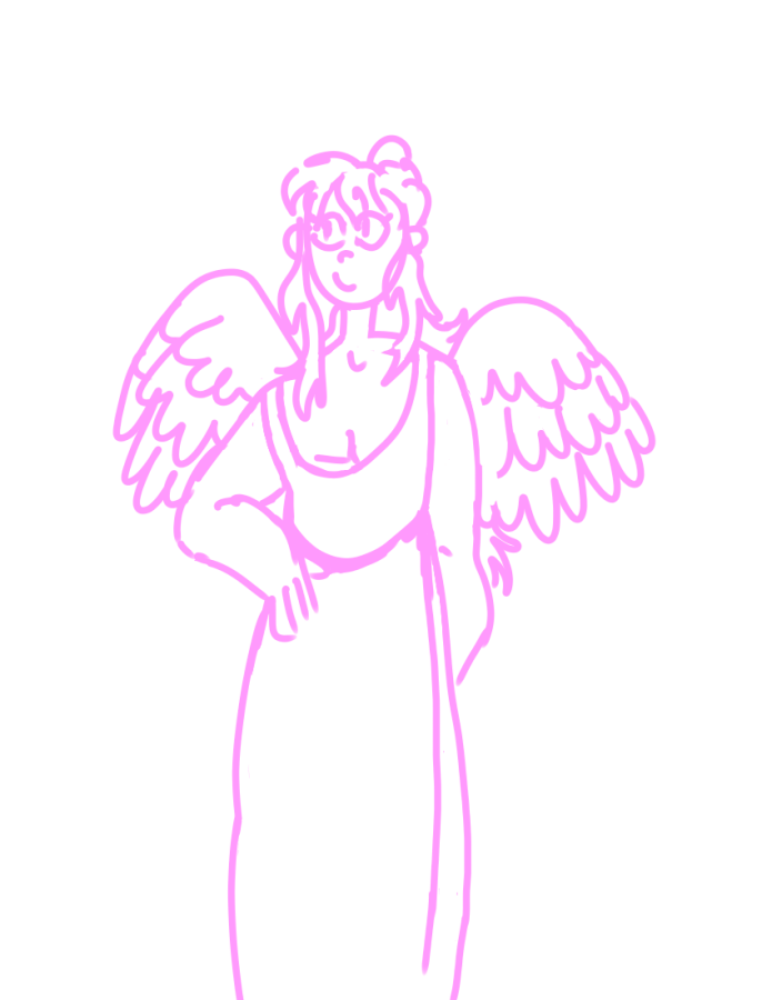
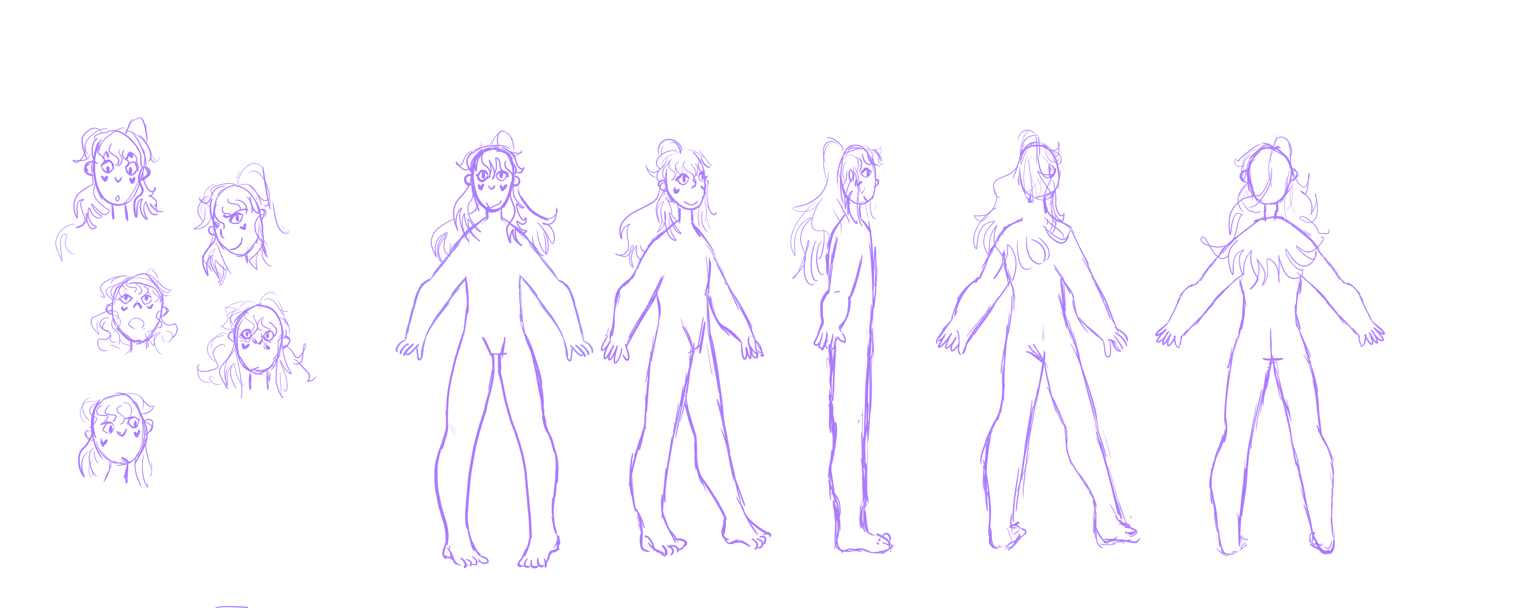
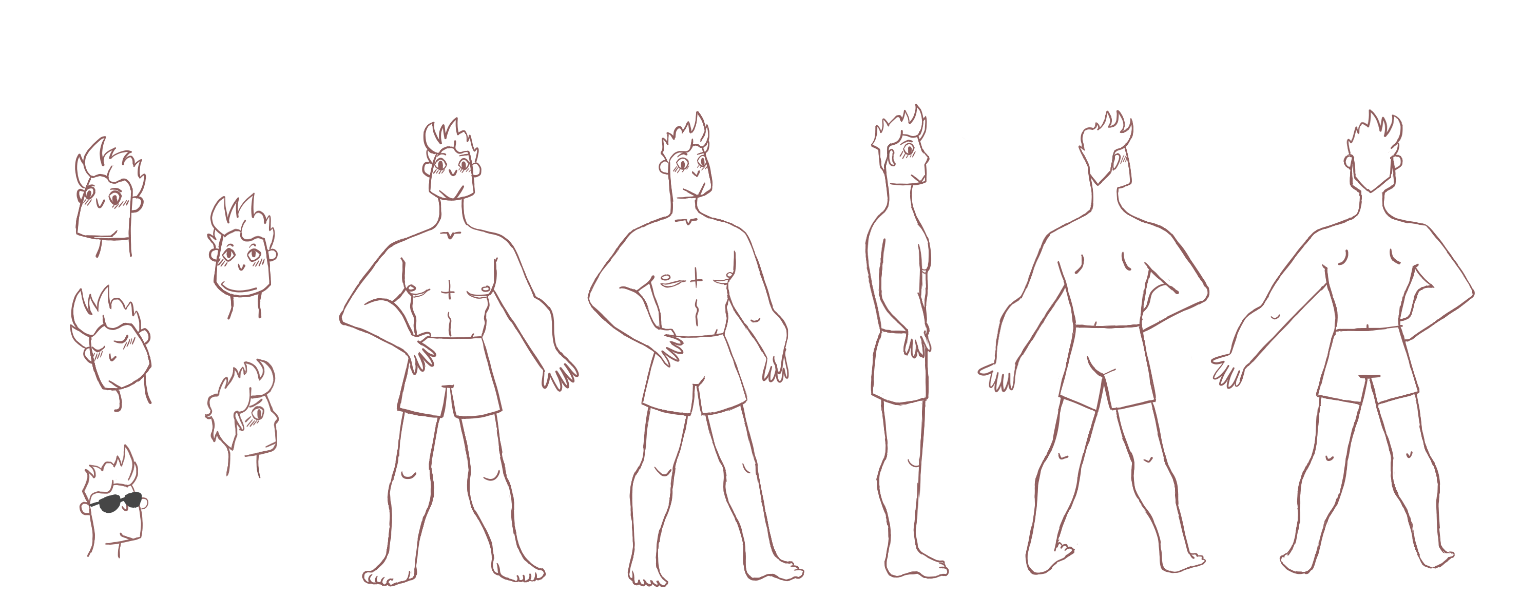
Character Model Sheets
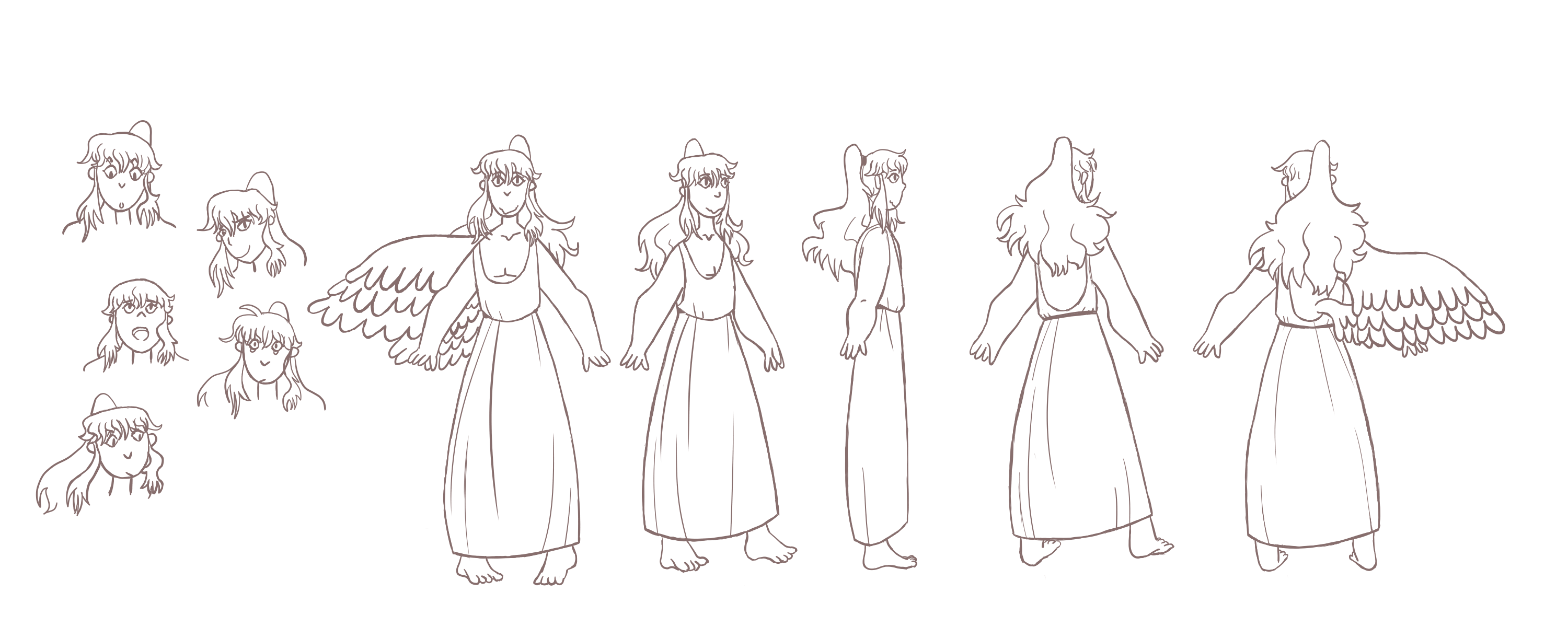
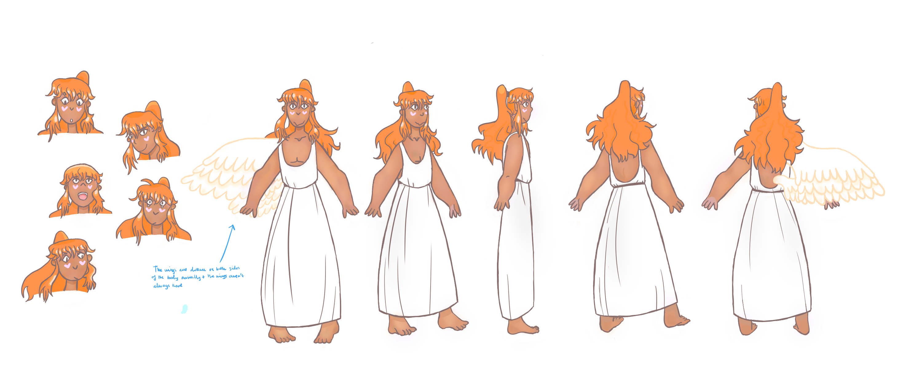
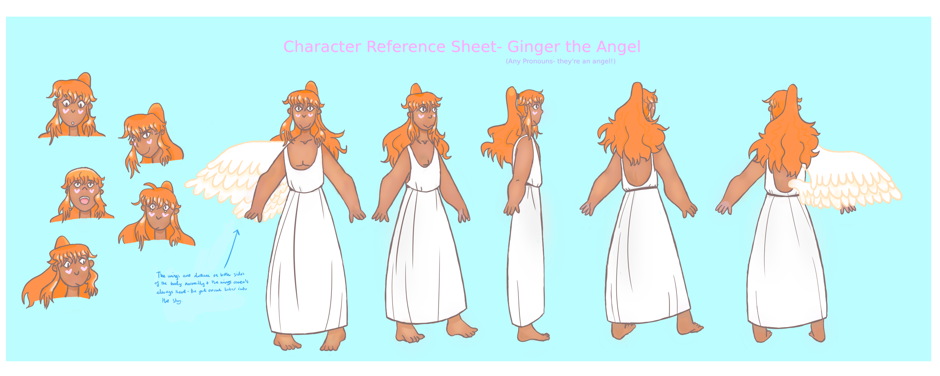
Character model sheets are made to keep a certain character’s animation consistent- so to make sure the character’s height, shape, details like clothing and necklaces and overall design remains the same scene by scene. This is meant for when teams of animators are working on the same project, and where different animators may be animating the same characters in different scenes. This is why the reference sheets contain examples of what the character looks like from different angles- this helps the different animators animate different angles.
Ginger
Originally based on an assimar (angel-adjacent) character for a DnD campaign, Ginger became a friendly and curious angel who I really enjoyed drawing. He was also one of the first characters I’ve ever drawn with darker skin (the skin tone references I used were people from South Asia), so I wanted to be careful and not make the skin look washed-out or ashy. I therefore went back to a few really great tutorials on how to draw darker skin.
Initial Sketches:
Sketch:
In this drawing, I wanted to get the (very stylised and androgenous) body drawn, so that the loose fitting robes would hang well. I also wanted to get the poses roughly correct.
Linework:
This took a really long time, as I wanted the varying line widths to work, and had to re-go over all of the anatomy.
Colouring:
The colouring took ages, because it took me a long time to get the skin tone looking natural* (I ended up adding some cool highlights so the skin tone worked with the warmth of the orange hair). I also did all of the colouring, went away and was still unsatisfied as it felt too floaty and inchoherent with all of the airbrush tool I was using. I went back and darkened the hair into a more consistent, deeper orange, and re-did all of the highlights. I think this keeps the ethereal look without looking too airbrushed. An animator friend also warned me that if I try to animate a character with a lot of airbrush, it’ll turn out blurry frame-by-frame, so I stuck to more solid shading.
The wings are also the only thing that I didn’t give dark linework, because I wanted to distinguish them from the rest of the body.
* I know I haven’t 100% got it right here and definitely need to practice more.
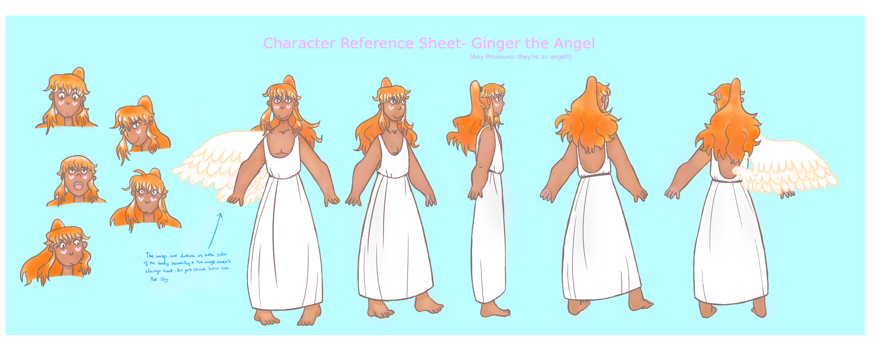
And the colouring I went for:
Final Touches
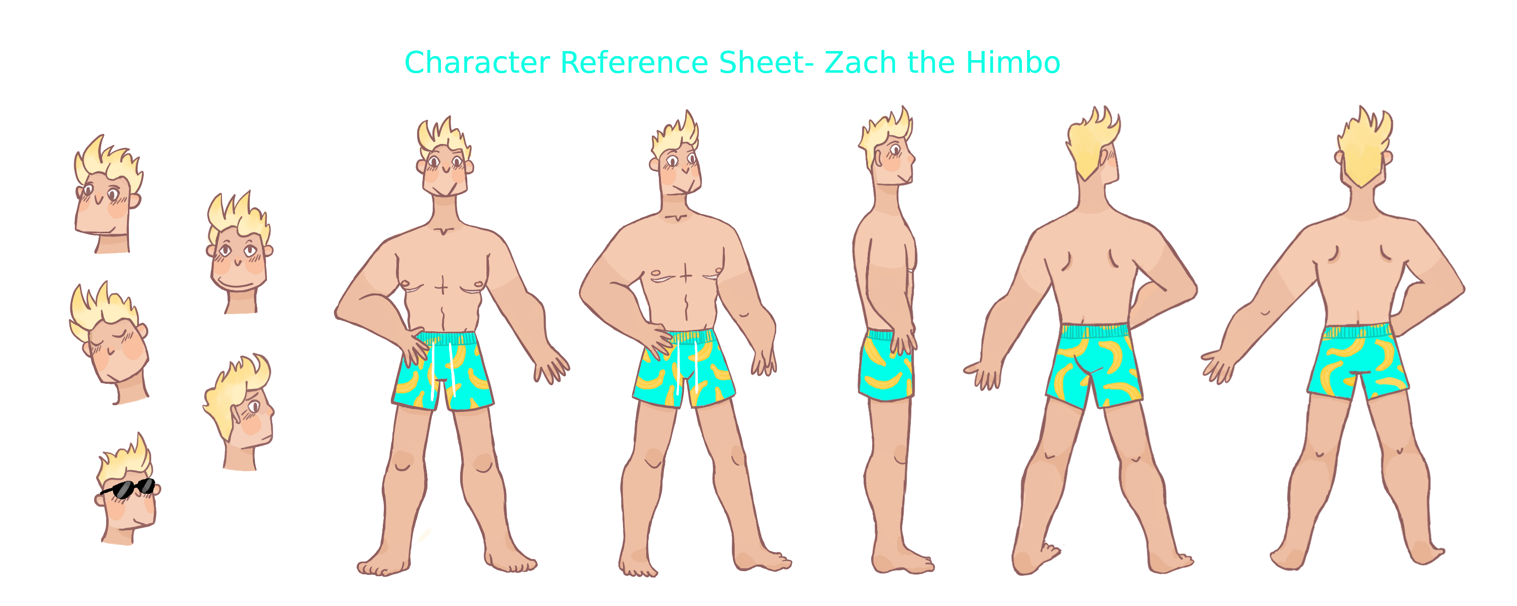
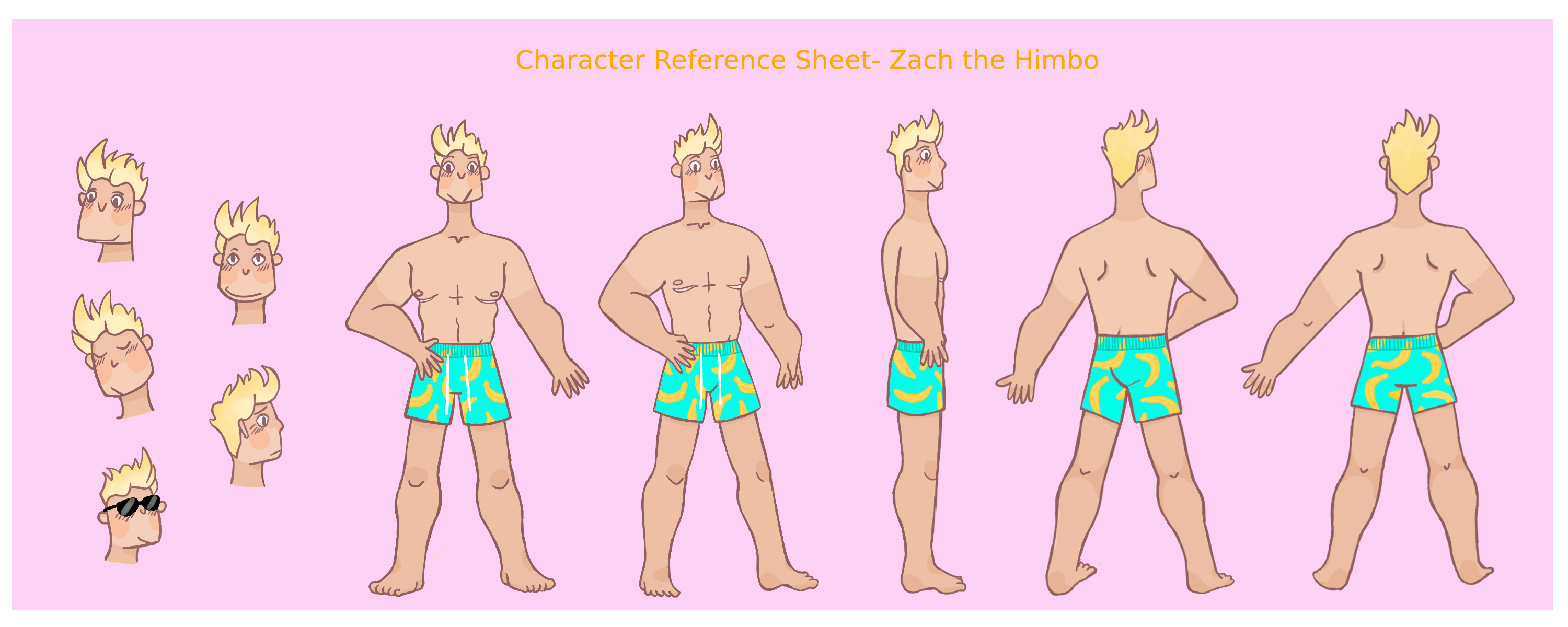
Zach
Feeling as though I should make another character reference sheet, I decided to avoid same-face-syndrome and go for a funky face shape and completely different body type to Ginger. This was all based on the idea of a ‘himbo’, a ‘Generally, a large (broad, tall, or buff) attractive man, who tends to be not very bright, but usually extremely nice and respectful. Think Kronk from The Emperors New Groove, or maybe a golden retriever.’ (put this in italics), according to urban dictionary. I think the term ‘himbo’ is really funny, and a lot of my favourite characters come under that archetype, so I decided my next character would be a himbo.
He had to be called ‘Zach’, because in a fanfiction I read when I was younger, the ‘hot jock’ character was called Zach and now I forever associate the name with beefy men.
All of these elements I tried to portray in his character design- he’s got bright blond hair that sticks straight up, he’s got a huge grin, a farmer’s tan, plenty of muscles and bright swimming shorts. I also decided to make him trans, because trans people are woefully underrepresented, and also I think trans people deserve to be represented in uncomplicated and fun ways! Hence the scarring under his pecs- these are the scars typical of ‘top surgery’, a process where the breast tissue is reduced to give the look of a flatter, more ‘masculine’ chest in FTM (female to male) trans people.
I didn’t want to put in any photos of anyone’s top surgery here, since I wouldn’t be comfortable doing that without their permission, so check out this blog that documents someone’s experience with top surgery here and the online tutorial I used to help me with top surgery scars here. I also found a useful website that explained the basics of the surgery here
Sketch:
Linework:
As you can see from the fact I changed a few faces from the sketch phase, I struggled with this new faceshape as I was more used to drawing ovals. Got there in the end though!
Colour:
The colour took me a while, as I came into conflict with the dreaded skin tone again- I found a good reference image (not just for the skin, for the body type too), by searching something like ‘attractive man on beach’. Having something to go from really helped. I also really struggled with the kind of tan pattern I wanted until a friend suggested a farmer’s tan. It felt perfect because it ties in with an in-joke that a lot of FTM trans people are initially cautious about showing their chest at the beach and instead wear loose t-shirts.
The banana shorts were a lot of fun to draw. At some point in the past I’d become mildly obsessed with them, and done a lot of amazon research trying to find my favourites, so I had plenty of reference images for them.
Final touches:
I added a pink background because it was funky, and held off on putting Zach’s pronouns as I thought the term ‘himbo’ was pretty self explanatory.
Environment Concept Design
Concept art is where artists illustrate potential ideas for a piece of media. This can include settings, characters, animalia or even just the vibe. In this case, I’ve been experimenting with designing environments!
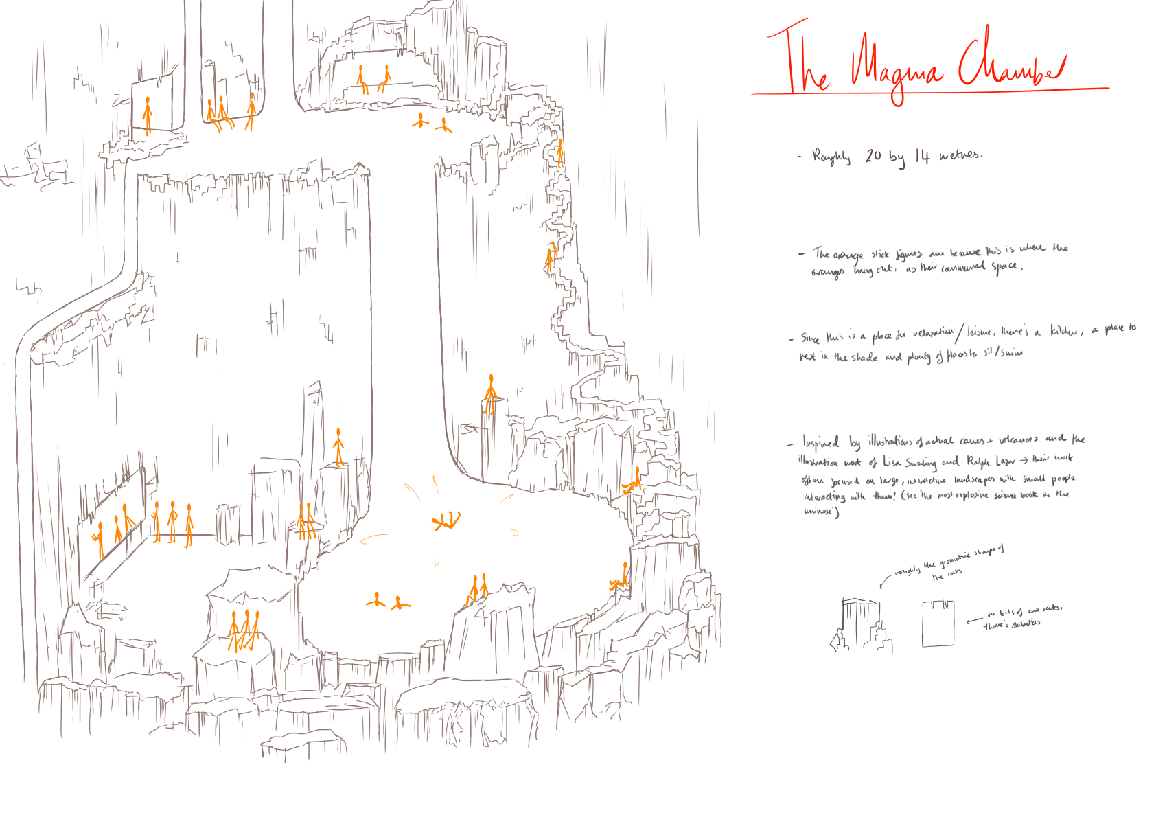
The Magma Chamber
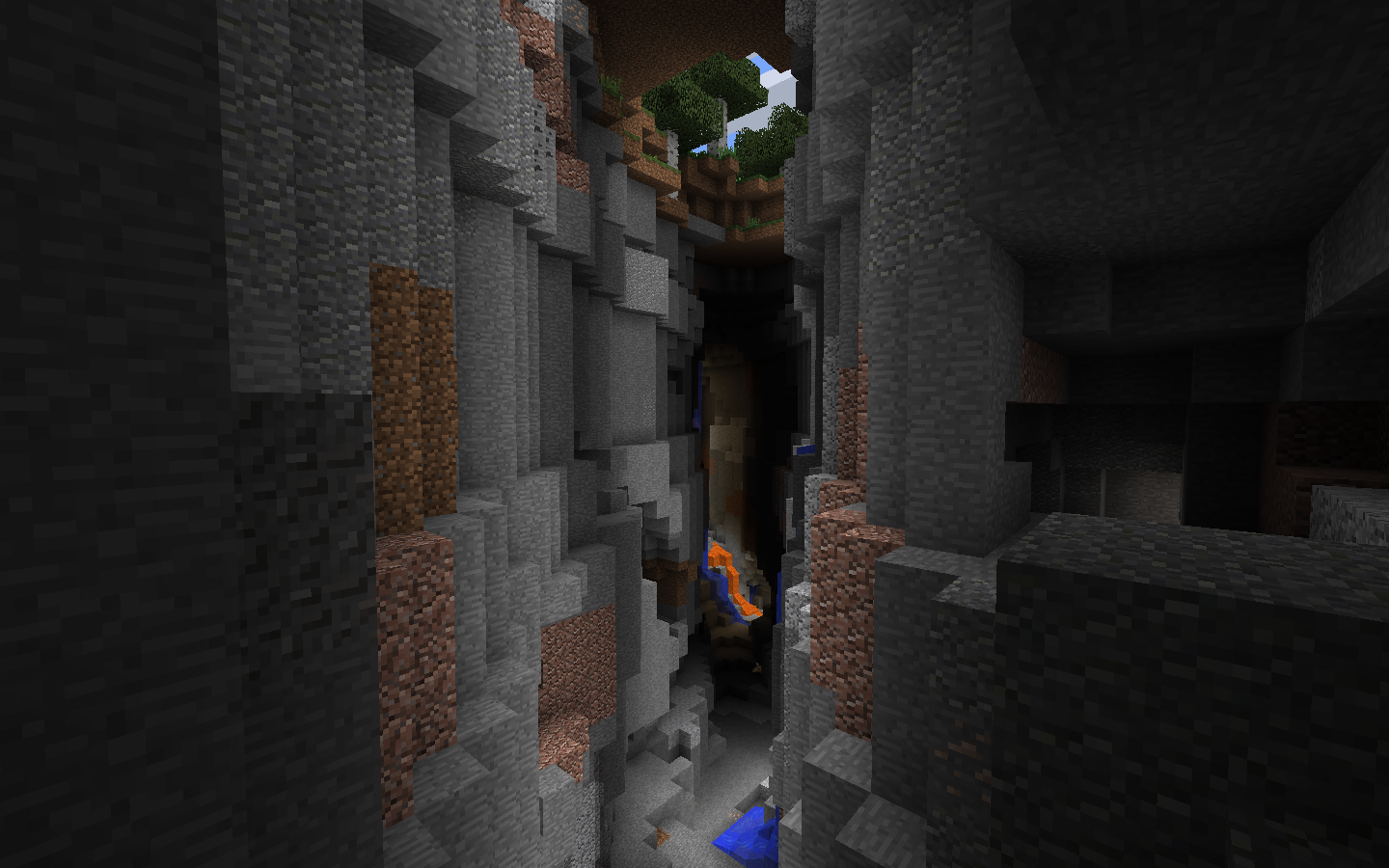
For this setting, I knew all along that I wanted it to take place on the inside of a magma cave, with walls steep in the same way as a Minecraft ravine, just on a different scale with a completely different style. I then started taking a look at actual magma caves, as well as volcanoes (a childhood obsession) and the way that the lava flows.
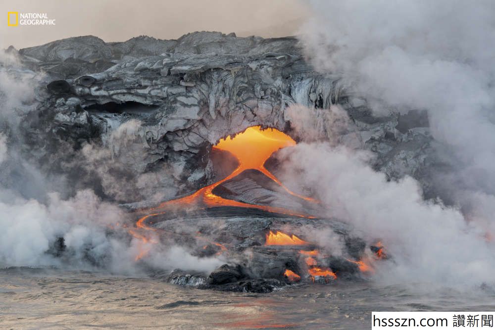

I also took a lot of inspiration from ‘The most explosive science book in the universe’, which is illustrated by Lisa Swerling and Ralph Lazar, which feature miniature cartoon humanoid creatures interacting with all of the environments in the book (in a way less horrifying way than I made it sound). The interaction that characters could have with a certain environment is very important to me, and a fun idea I wanted to explore with both of these pictures.
Initial Sketch:
Finished Design:
For this, I added people more definitively, and sorted out some issues with perspective. I also added some notes on the side to explain what inspired me and what I was going for.
Here's how you can make bold and italic text.
Here's how you can add an image:

Here's how to make a list:
To learn more HTML/CSS, check out these tutorials!